The Overall Project
When i first started this course, my drawing ability was severely lacking in all aspects. This was probably apparent from my original portfolio where i could barely even draw a cartoon without the entire drawing becoming alien and generally disfigured. This kind of struck me two ways when it was announced that we needed to develop a prop, character an environment as i had apsolutely no prior experience.
The first thing i thought about was how it would even be possible in the time frame, especially with all the development required along the way, making me rather nervous. After taking quite a risky leap towards designing the character from scratch in the very first week, i spent countless hours just working on a head until i was left with something relatively decent. After adding simple shading and spending an un-neccersary amout of time drawing scales across its face, i was left with something that i had no idea was even possible for me.
This is where the course struck me a second time with the realisation that if i kept working at it, i could probably make a lot of progress within the 12 weeks, even if it was quite a short time period. After showing my original sketches to both CDDA lecturers i began to see the faults in my work and huge areas i had managed to overlook, more specifically in the shading. After being shown a few example of how the light and shadows would affect various objects and shapes, i was able to then go away and practise this in photoshop by overlaying black and white brushes over my original drawings.
It may have taken a huge amount of trial and error but eventually i managed to get it relatively correct which allowed me to apply it to differant areas, allowing me to visualise flat images/ sketches as 3D work, showing me roughly where differant levels of shading should be located. Combining these new skills with the texture development in the Intro to 3D section of the course, i began experimenting with the photoshop colour pallet, real images and the lighting techniques, applying them to my work whenever possible.
By this stage, i had spent roughly 8 hours a day on average from the start, jsut practising and trying my best to get apsolutely everything i possibly could from the course as it was very possible that i would never get this level of feedback again. I was left incredibly overworked for the entire unit with between 300 to 400 hours total put in from start to finish but this was my choice and i do not regret it in the slightest as my level of understanding and general improvement through these countless hours has left me in a position where i feel fully comfortable drawing and creating what i otherwise thought was impossible for me.
Spending roughly 20 days of the 12 weeks on the final products and the rest of the time developing my skills, im very happy with what i have achieved. I still find that i struggle quite a lot with drawing faces from scratch at odd angles, especially animal faces as atempting to imagine them in a perspective view feels abnormal due to their generally long shape but the skills picked up in life drawing, the creative freedom and general appeciation for art which i have picked up on the way are priceless, allowing me to now further develop my ideas and style independantly. At first, i thought that the constructive feedback from some third year students was quite harsh but this was only due to my lack of understanding.
Now i just see it as an excellent way to improve, allowing me to see areas i may have overlooked from an entirely new perspective. I wouldn't say that i had a favorite area of the concept development as i enjoyed eahc of them equally, some may have been rather long winded, leaving me worn down by the end of the 12 weeks but this is always expected with leaving myself very little to no breaks. Character wise, i loved the concept of creating something entirely new but getting hte correct proportions in differant angles is fairly tedious, especially with msucle definition.
The prop seemed rather straight forward as it was generally a far less complex shape and allowed me to play around a lot with photo-overlays but the environment truely gave me freedom. As it more down to scale, perspective and lighting, i did not have to worry very much at all about proportions as nature generally creates entirely unique forms.
In conclusion, what i learnt from this has given me a new level of confidence with my drawing in general, i just wish that i had transitioned to Photoshop from the very start as i adopted quite an awkward technique of drawing something by hand before then painting over it within the software, forcing me to adapt the photoshop work around any issues with the original drawing, be it lighting or down to general errors which would then be near impossible to change.
I will be attending life drawing sessions in the future due to how much progress is made over such a short period of time. Having a life model just makes it far easier to draw and understand proportions, texture and lighting in comparison to a photograph.
Thursday, 12 December 2013
Environment and Rough Perspective
Life/ Environment Drawing
With being the final week of life drawing and due to how few people turned up to the session, we were able to try something a little different with natural, flowing environments, taking careful note of the perspective and angle to then place a figure in what looks like his natural setting. This was incredibly enjoyable as environments provide far more creative freedom in both detail and overall scale, allowing me to attempt and then utilise a variety of new techniques.
Using charcoal as a basis for the vast majority, we were given 20 minutes to work on each setting with the goal of capturing the scene with only simple, basic details.
Unlike the vast majority of life drawing sessions where the first few images would look crooked, i used what i had learnt from my environment concept and development and general will power from four sleepless days to lay out the basic principles with rough black lines. Imagining it as a concept sketch, i focused entirely on proportions and areas of interest whilst leaving room to then build up with other media at a later date.
Overall, i believe that this was the best sketch of the day as i managed to create what looked like a full concept of a woodland road, taking in to account all the tree distances, widths and densities as they began to merge in to the forest. on top of this, i then managed to create a silhouette of Gordon standing at the front, holding his bow with excellent scale and proportions.

The second drawing was a little bit different but still had a huge emphasis on scale and proportions. We were shown a photograph of a hand holding a globe in its palm. With Gordon then posing in the centre of the room, we had to place him within the image in an effective and mysterious manor.
At first, i thought that the hands would have looked a bit disfigured but after some trial and error as well as basic lighting and shadow, i was able to create the base drawing with a large circle in the centre where the globe was located within the original image. This gave me a large, open space to then draw Gordon sitting inside the globe with the illusion of him being watched through some form of magical orb.

We were then told to experiment with finger painting, taking us back to our childhoods. This combined with abstract colour and Christmas music created quite a nice exploratory environment. With such a loose concept of merging Gordon in to a cloudy sky, we were really able to experiment with colour, smudging and general contrast to create a rather amusing product which captured the full emotion of the atmosphere around us.
It was an interesting idea and a lot of fun to experiment with but i don't think I'll be re-visiting this method in the future. Without the ability to correct mistakes or create fine lines, it made for quite an uncomfortable technique.

The final twenty minute sketch was by far the largest in scale which at first looked incredibly over-whelming but by just allowing yourself to entirely free your movements, sketching out each abstract detail with charcoal in the correct perspective felt incredibly natural. Starting with the main detailed foliage on the left, i began to build up the bottom half of the image, sketching a rough box and outline to show where the waterfall and general water flow was located.
After building around this, adding in rough details and emphasising key areas, i could then use the contrast of the white chalk to then build up the sharp lighting and water. With all the basic detail down, i could then start to incorporate Gordon in to the focus point; the great waterfall. As this was located in the direct centre of the image, i could draw his rough structure to scale, standing in front of the water fall using the sharp edge of the black charcoal.
After he was generally drawn to the same level as the environment around him, i switched back to the white chalk and began emphasising a few of his edges with rough lines to show where his body hit the flowing water. Using the side of the chalk, i could create a nice mist effect over his pose and then add some flicks of white travelling down, from his head to his knees which fully submerged him wit the watery backdrop.

I find work like this to be incredibly enjoyable and only wish that i could have attempted this prior in the year as the twenty minute time limits were no where near enough time to add the detail truly required to bring the sketches to life.
Wednesday, 11 December 2013
Side Task Catchup
Weekly Tasks
We were set a number of small tasks to complete over the 12 weeks to show skill development and general proof of understanding. This included simple shading, photo manipulation and even general research in to other artists we took inspiration from. A few of these tasks are already updated in to the blog at previous points but due to my huge focus on the character, prop and environment development, i never got round to uploading these.
The Elf Archer (Colouring Practise)
This was one of the first tasks we were set out to complete and was incredibly straight forward. As an introduction to photoshop, we were provided with graphics tablets, a small sketch of a fantasy elf archer and were then told to attempt to colour it in to the best of our ability. As this was my first experience with the software and i was relatively new with graphics tablets , it was very simplistic but looking at it in comparison to my final work, you can see a huge bound in quality, especially in forms of shading and depth.
This was not just colouring practise though, it functioned more as a way of getting us to think in layers, separating different areas of the image to make them overall easier to work with and complete, making it far more forgiving that a solid image/ single layer which could destroy an entire image with just a single lapse of judgement.

Clouds (Blending and Custom Brush Practise)
This task was more of an extension on to the elf archer, getting us to think more about colour blending and the use of custom made brushes to add more definition to our images, getting away from the cell shading methods used previously.
The task was fairly loose and generally quite simple but was very helpful for teaching us the base principles of when to and not to use smudge tool, how we can make intricate looking features by simply building up simple shapes and finally, how we could then use the custom brush elements to repeat these methods over a large area with minimal time and effort.

Concept Artists
This task was entirely research based with the requirement of us finding, studying and then identifying why we like the look, feel and overall atmosphere of various concept artists work, allowing us to really get a feel for the work process and how we could attempt to incorporate these steps in to our own work.
Robert Mckinnon
http://www.krop.com/robmckinnon/#/
This was my first choice when it came to concept artists. With an obscene number of projects worked on, his concept art was included within films such as Iron Man 3, games such as Resident Evil 5, huge blockbusters such Tron, Total Recall and almost everything big in the film industry. This definitely shows in the concept art he produced, demonstrating his complete understand of life as a whole. His work consists of anything ranging for futuristic sci-fi even to pre-historical animals.


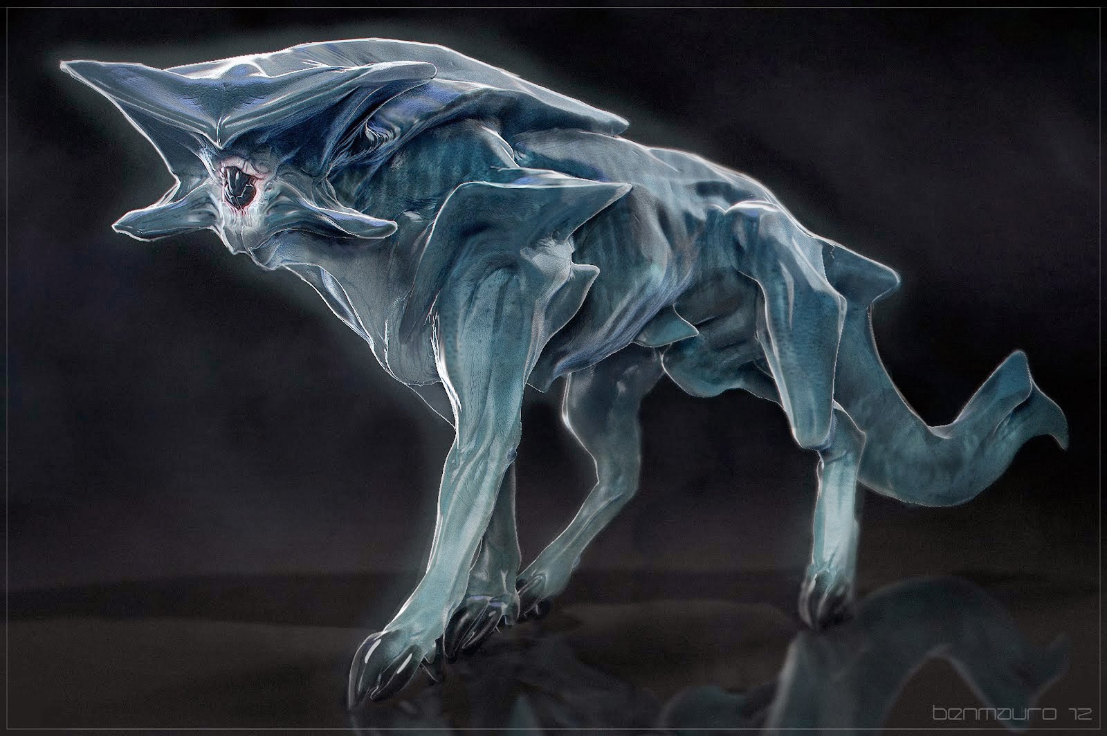
Ben Mauro
http://www.artofben.com/
Ben Mauro is my second concept artist of choice but not because of the overall detail of his work. What i really love about his work is how he utilises sharp shading techniques to make his concepts almost stick out of the screen with a huge level of depth.
His understanding of art as a whole has allowed him to create concepts that otherwise sound impossible, for example; have you ever heard of a canine type creature mixed with the aesthetics of a metallic machine? Ben Mauro has managed to combine the elements of nature and machinery in such a defined and flowing way that the creature looks like a living being whilst also having the illusion of a man-made machine, creating a form that is generally alien to us.

Artwork like this is what makes me want to learn and thrive in this industry. The ability to create something that could never exist is any logical setting but to then add understanding behind is truly the greatest form of art in my opinion. I just hope that one day i will be able to grasp the same level of ingenuity and understand to create such beauty.
Avery Coleman
http://averycolemanart.blogspot.co.uk/
Avery Coleman is a very different concept artist to the two previously covered in this post. To my knowledge, he does not work towards any photo-realistic concepts and adopts a very cartoon art style. This alone would not make him a very good source of reference as my development throughout the course was to lead up to a more realistic end product but there are a few areas of his work that i found extremely interesting.
Firstly, his use of colour and the contrast within his pallet. In a lot of his concepts, he has combined a lot of sharp, blunt colours that generally would not be seen but through his hand painted textures and in depth attention to both light and shadow, the work he has produced feels as if it has a warm glow and a lot of depth.

The second area is how he shows his process of building up concepts from entirely flat sketchbook work to black and white, full 3D drawings, just with the use of lighting. I find this amazing how such a flat sketchbook image can be given so much life just with the contrast of white and black. The way it so directly affects the image then allows the depth of any feature to be brought either forwards or backwards without ever having to touch the original line art.

By studying his creative cycle, i hope i can improve my own knowledge over time to the point where i can understand the depth of even a simple sketch and bring it in to a full 3D light. At this current time I'm developing a basic understanding but it is far from perfect.
Photo-manipulation
For this task, we were required to show evidence of photo-manipulation as proof that we understand the concept of lighting, tones and general details equired to place one imagine in to another without making this obvious, practically merging the images togather in a natural and effective manor.
For this, i decided to attempt to merge an old wooden house in to the clearing of the woods with all the lighting and colour differances taken in to concideration. I know its quite a generic idea but it gave me quite a nice basis to work with and allowed me to experiment with differant tools.
These were my two base images which i used from the start;

By simply looking at the images, you can tell that they are from entirely differant settings with the landscale looking very vibrant and full of life whilst the house is incredibly stale and bleak looking. Now i had both base images, i loaded the landscale in to photoshop and simply placed the house image on top of it in a area that generally looked suitable.
This left me with practically two boxes inside each other so i then had to use the pen tool to intricatly outline the entire house so i could apply a clipping mask, removing the entire boarder. The only problem now was that it looked like the house was sitting on top of the grass instead of behind it which wasa huge problem for realisim.
To fix this, i created a copy of the foreground, rubbed away a bit of the grass detail where the house was sat and then placed it above the house layer. After toying around the the clone stamp tool and blur tool a bit more to add the corre grassy overlay at the base of the house, i maanged to created a semi-realistic looknig setting. The only issue now was the lighting as at this stage i had not worked much with light and shadow, making it a fairly difficult test of trial and error.
The first thing that became apparent through was the colour differant between the images so i added a light brown filter to the overall project to push boh images to roughly the same colour scheme. Due to the position of the house, below the tree line and the direction of the light, the front of the house would be blocked away from any direct sunlight so i had to darken the windows specifically with a low opacity black filter.
After all of this was done, i attempted to repeat the same techniques for the roof where the sun would have mostly caught the house but the lighting and shadown contract to the right of the house proved a near impossible task to put right due to how i had attempted to put an incredibly dark image in to an incredibly light landscale, not to mention the lighting position.
Overall, i think it was a good starting point but i should have put more time in to find images that had roughly the same light as this would have made the task far easier and fewer changes would have had to be made.

We were set a number of small tasks to complete over the 12 weeks to show skill development and general proof of understanding. This included simple shading, photo manipulation and even general research in to other artists we took inspiration from. A few of these tasks are already updated in to the blog at previous points but due to my huge focus on the character, prop and environment development, i never got round to uploading these.
The Elf Archer (Colouring Practise)
This was one of the first tasks we were set out to complete and was incredibly straight forward. As an introduction to photoshop, we were provided with graphics tablets, a small sketch of a fantasy elf archer and were then told to attempt to colour it in to the best of our ability. As this was my first experience with the software and i was relatively new with graphics tablets , it was very simplistic but looking at it in comparison to my final work, you can see a huge bound in quality, especially in forms of shading and depth.
This was not just colouring practise though, it functioned more as a way of getting us to think in layers, separating different areas of the image to make them overall easier to work with and complete, making it far more forgiving that a solid image/ single layer which could destroy an entire image with just a single lapse of judgement.
Clouds (Blending and Custom Brush Practise)
This task was more of an extension on to the elf archer, getting us to think more about colour blending and the use of custom made brushes to add more definition to our images, getting away from the cell shading methods used previously.
The task was fairly loose and generally quite simple but was very helpful for teaching us the base principles of when to and not to use smudge tool, how we can make intricate looking features by simply building up simple shapes and finally, how we could then use the custom brush elements to repeat these methods over a large area with minimal time and effort.

Concept Artists
This task was entirely research based with the requirement of us finding, studying and then identifying why we like the look, feel and overall atmosphere of various concept artists work, allowing us to really get a feel for the work process and how we could attempt to incorporate these steps in to our own work.
Robert Mckinnon
http://www.krop.com/robmckinnon/#/
This was my first choice when it came to concept artists. With an obscene number of projects worked on, his concept art was included within films such as Iron Man 3, games such as Resident Evil 5, huge blockbusters such Tron, Total Recall and almost everything big in the film industry. This definitely shows in the concept art he produced, demonstrating his complete understand of life as a whole. His work consists of anything ranging for futuristic sci-fi even to pre-historical animals.

The level of detail is near unbelievable, creating concepts entirely from his own mind which end with a photo-realistic product which blurs the lines between reality and fantasy. The sheer creative genius of some of his artwork even steps on to no-mans land, mixing up ideas in such a way that they they seem near impossible and ridiculous in nature, only in seeing his concepts could you ever believe that he turned them in to a reality.

After starting his obsession for art at the age of three with a small box of crayon and ending up with such beautiful artwork, Robert Mckinnon is a concept artist that heavily inspires me.
http://www.artofben.com/
Ben Mauro is my second concept artist of choice but not because of the overall detail of his work. What i really love about his work is how he utilises sharp shading techniques to make his concepts almost stick out of the screen with a huge level of depth.
His understanding of art as a whole has allowed him to create concepts that otherwise sound impossible, for example; have you ever heard of a canine type creature mixed with the aesthetics of a metallic machine? Ben Mauro has managed to combine the elements of nature and machinery in such a defined and flowing way that the creature looks like a living being whilst also having the illusion of a man-made machine, creating a form that is generally alien to us.
Artwork like this is what makes me want to learn and thrive in this industry. The ability to create something that could never exist is any logical setting but to then add understanding behind is truly the greatest form of art in my opinion. I just hope that one day i will be able to grasp the same level of ingenuity and understand to create such beauty.
Avery Coleman
http://averycolemanart.blogspot.co.uk/
Avery Coleman is a very different concept artist to the two previously covered in this post. To my knowledge, he does not work towards any photo-realistic concepts and adopts a very cartoon art style. This alone would not make him a very good source of reference as my development throughout the course was to lead up to a more realistic end product but there are a few areas of his work that i found extremely interesting.
Firstly, his use of colour and the contrast within his pallet. In a lot of his concepts, he has combined a lot of sharp, blunt colours that generally would not be seen but through his hand painted textures and in depth attention to both light and shadow, the work he has produced feels as if it has a warm glow and a lot of depth.

The second area is how he shows his process of building up concepts from entirely flat sketchbook work to black and white, full 3D drawings, just with the use of lighting. I find this amazing how such a flat sketchbook image can be given so much life just with the contrast of white and black. The way it so directly affects the image then allows the depth of any feature to be brought either forwards or backwards without ever having to touch the original line art.

By studying his creative cycle, i hope i can improve my own knowledge over time to the point where i can understand the depth of even a simple sketch and bring it in to a full 3D light. At this current time I'm developing a basic understanding but it is far from perfect.
Photo-manipulation
For this task, we were required to show evidence of photo-manipulation as proof that we understand the concept of lighting, tones and general details equired to place one imagine in to another without making this obvious, practically merging the images togather in a natural and effective manor.
For this, i decided to attempt to merge an old wooden house in to the clearing of the woods with all the lighting and colour differances taken in to concideration. I know its quite a generic idea but it gave me quite a nice basis to work with and allowed me to experiment with differant tools.
These were my two base images which i used from the start;

By simply looking at the images, you can tell that they are from entirely differant settings with the landscale looking very vibrant and full of life whilst the house is incredibly stale and bleak looking. Now i had both base images, i loaded the landscale in to photoshop and simply placed the house image on top of it in a area that generally looked suitable.
This left me with practically two boxes inside each other so i then had to use the pen tool to intricatly outline the entire house so i could apply a clipping mask, removing the entire boarder. The only problem now was that it looked like the house was sitting on top of the grass instead of behind it which wasa huge problem for realisim.
To fix this, i created a copy of the foreground, rubbed away a bit of the grass detail where the house was sat and then placed it above the house layer. After toying around the the clone stamp tool and blur tool a bit more to add the corre grassy overlay at the base of the house, i maanged to created a semi-realistic looknig setting. The only issue now was the lighting as at this stage i had not worked much with light and shadow, making it a fairly difficult test of trial and error.
The first thing that became apparent through was the colour differant between the images so i added a light brown filter to the overall project to push boh images to roughly the same colour scheme. Due to the position of the house, below the tree line and the direction of the light, the front of the house would be blocked away from any direct sunlight so i had to darken the windows specifically with a low opacity black filter.
After all of this was done, i attempted to repeat the same techniques for the roof where the sun would have mostly caught the house but the lighting and shadown contract to the right of the house proved a near impossible task to put right due to how i had attempted to put an incredibly dark image in to an incredibly light landscale, not to mention the lighting position.
Overall, i think it was a good starting point but i should have put more time in to find images that had roughly the same light as this would have made the task far easier and fewer changes would have had to be made.

The Final Products and Blistering Work Ethic
12 Weeks of Insanity
After the 12 weeks of concept development, i started entirely from scatch with no previous skills and then had to build up a character, prop and environment to atleast a recognisable style, taking lighting in to full concideration. I am rather happy with the results as a huge leap has been made from original concepts, leading on to the finished products.


After the 12 weeks of concept development, i started entirely from scatch with no previous skills and then had to build up a character, prop and environment to atleast a recognisable style, taking lighting in to full concideration. I am rather happy with the results as a huge leap has been made from original concepts, leading on to the finished products.
Character Sheet
Designing and then bringing my character to life was an
extremely tedious and time consuming task. Even with all the previous research
and development, It was fairly daunting in terms of scale. I had to re-draw my
entire character with a bulkier and more proportioned body as the previous
concepts had far too many flaws the salvage. They were on the right path
though.
For the Character sheet with the front, back and side pose,
I spent a lot of time just looking at poses on the internet, including Davin
chi’s interpretation of the human body, attempting to take all of this in to
account before physically drawing my character. Using all this information,
including the height in heads, I managed to draw a front view which looked very
similar to the original concept but with larger muscles and more structure.
After rubbing out the guidelines, I re-drew over all the
defining lines which left me with a basis to work with. Using this, I could
then run lines across the paper to set proportions to work with for the back
and side views. Using the same techniques, I drew both the back and side views
with the original back concept as a reference guide.

I could then put it all in to Photoshop and begin to add
definition. For this, I took a picture of each drawing, cropped them on an A3
sheet and began to add shading. This was by far the most time consuming but
also rewarding bridge to cross as I simply could not image the characters in 3D
from my flat sketch. After a lot of practise in various areas such as the
character emotions I began to feel more comfortable with the shading in general
and could begin to add highlights to state where the light hit the character
and when the shadows then derived.

After doing this for all three sketches, I was able to
create a simple colour overlay with a mix of reds and oranges to add a bit of
life. The only problem I had at this stage was that my character looked a bit
too clean for his swampy setting so I added a mix between greys, browns and
greens to simulate the wear and tear of his life.
For the finished touches I then began to overlay different
scale textures, adapting and merging them in an attempt to add a bit of detail
to each pose. After a lot of trial and error, I was finally left with something
I was relatively happy to call my finished product but proportion wise, a few
issues were still present.

This was near impossible to fix in the timeframe though due
to my work process as I would have had to re-draw it in sketchpad format and
then re-import it in to Photoshop with hopes of it then working after
re-shading the entire pose.
Beauty Shot
The beauty shot followed the exact same techniques as the
character sheet from start to finish, starting with a sketchpad which then
ended in Photoshop. I did run in to quite a few issues whilst finding and then
drawing a suitable pose as anything I attempted to draw felt out of proportion
due to the slightly off perspective. Eventually I managed to draw a pose of him
twisting his body and extending his right arm in more of a stretching manor but
the face became incredibly problematic.
Drawing the face at a perspective view felt near impossible
and it took many attempts and studying to arrive at the face within the image,
even if the muzzle is probably twice as long as it should be.
Shading wise, it felt rather awkward with the twisted pose
to produce realistic lighting and shadow without leaning to either side to the
point of overwhelming and then blocking out the original colour. After a fair
few attempts, I managed to create a lighting layer which added a suitable level
of depth to the sketch.
With the general colour a texturing, I followed the exact
same set of steps as with the character sheet and played around with different
colour intensities until it looked roughly the same. The only thing I was
forced to do differently texture wise was to scale it up slightly and overlay a
duplicate with a slight off-set to match the odd angle of the pose. Overall, I
believe that the face could be improved greatly and the colours could be more
concentrated but due to time limitations, this was not possible in time for the
presentation.

Expressions
For my character’s expressions I first looked at a lot of my
previous sketches, including the incredibly happy and over-enthusiastic sketch
I completed previously. As I drew four separate expressions, it was by far the
most time consuming part of the entire project, especially as I drew each face
entirely from scratch on A3 pieces of paper, making them as large as physically
possible in hopes of created an incredibly detailed and defined end product.
This worked greatly to my advantage in the long run but involved
at least ten hours of work on each expression. This is due to the two hour
period required to create and define the line art, the hour taken to then
simply shade each face and then the remainder to draw each scale entirely by
hand.
Once these were completed in sketch form, I then took a
picture of each one and placed them in Photoshop with the same workflow as the
previous character sheets/ beauty shots, layering low opacity black and white
brushes on top of an overlay layer to make each face stick out from the page.
After all this shading was fully completed, I was able to simply overlay all
the basic colour on top of the shadow and general lighting to add the final
definition.
As I had drawn the texture by hand before putting each
drawing in to Photoshop, I did not need to use any photo-overlays which would
have sped up the process greatly but not left me with such a fine end result.
I regards to the eyes, I began watching counters video and
written tutorials in an attempt to make the wet-looking reptilian eye, crossed
with a humans. Eventually I found a technique of layering different coloured
circles with blur effects and fine drawn detail which combined to make a
photo-realistic result.
Full workflow;

Happy and Sad Closeups. - Detailed.

Normal and Generally Under the Weather. - Detailed.

Prop Sheet
When designing the final idea for my prop, I looked back at
a lot of the previous concepts that I had created, settling entirely on the
home-made bag idea. After a few experimentations, I decided to re-visit my
original concept and vastly increased/ improved the detail. The original was
simply a refined square with a few construction lines to specify where each
component would be located so I had to refine each edge, giving it a more
fabric feel, draw in details such as the tears in the leather and blunting
outline each defining area so it would be ready for Photoshop. I could then use
the base drawing to carry out line across, making it much easier to then draw
the back and side views with the same level of quality.
Once I was entirely ready to Photoshop them, I took a close
up picture of each pose and then cropped them on an A3 canvas to give me enough
room to work with, detail wise. The next step as with the character sheet was
to define the shape and dynamics using a black and white layer which I used to
draw in the light and dark areas with a hard brush. It felt rather difficult to
define the shape with the lighting I chose but after a lot of trial and error
combined with a few thinner black lines, I was able to shade each image to a
standard where I could then add texture and basic colour to really bring them
to life.
As I had not physically drawn the texture in within the
sketch, after adding the base colours I had to use quite a few photo-overlays
to add the leathery effect to each component of the bag. The drawing was
suitable with only base colour to be titled an end product due to the shading
but the combination of hard and rough leather combined really made each view
stand out. Using the techniques we learnt in the Intro to 3D for texturing, I was
able to pass the skill set directly on to the prop to make something that I was
relatively proud of.

The beauty shot followed the exact same premise from start
to end as the prop sheet but with a lot more detail added in areas such as
shading and the base sketch. The base sketch I used once again was an original
concept but with a lot more detail added in areas such as the tears in the
leather and the strap and general details which really make the concept. This
was a much more time consuming task to ensure that the original shading was
done correctly but after many hours of dedication, I was able to make it look
almost fully 3D. Using the texturing I had picked out and adapted from the prop
sheet, the texturing became a very fast and highly rewarding process.

The Environment
The environment was the largest task I worked on in terms of
the scale of a single image and felt incredibly overwhelming to start with but
by utilising the same work structure of going from sketch, to shading, to
colour and then finishing off with texture really helped simplify the process. When
I first focused on the concept, I wanted to create an area that my character
could have once called home but with a more wore down atmosphere so it feels as
if it has aged alongside my character.
After doing both quick and long sketches of what I hoped to
achieve as mentioned in the original presentation, I found a setting which I wanted
to develop further, this being a partially flooded swamp with the remains of an
old stone structure, rotten planks and a large focus point in the form of a
tree which I could detail with the age of the entire scene.
Drawing this up was not too difficult a task as I felt
comfortable enough with a sketchpad to put my ideas on to paper to a level
which I could then build up from. Perspective wise, I ran in to a few issues
which I found very challenging to overcome, especially once I put the sketchpad
down and began adding colour and shadow.

I left this task until I had completely finished my
character sheet and expressions so I felt confident enough with the shading to
add what looked like sun glare and drop shadows to each of the protruding
rocks, both in the water and on the ground. It may have taken a fair bit of tweaking
but through multiple layers, I was eventually able to produce a greyscale image
which looked as if it had quite a lot of depth to it, even down to the contract
in the water, blurring it to the sides to simulate the slightly unsettled water
surface.
The next step was then to add in the basic colour to the
image on an overlay layer, allowing me to define the details to the point where
the overall concept was highly recognisable and I could see it starting to come
together. Having the colour separated on to another layer helped me greatly
when it came down to getting the correct tones as I could simply experiment and
add whatever colours I wished to test on different layers with a hard brush.
One I got the full colour scheme which the merged in with the shading, I could
add the final touch-ups with a small, hard brush as well as with the use of
multiple photo overlays to add the defining texture.

Simply texturing this image became the most time consuming
task as I went through a near finite number of source images, even taking my
own of wood bark to try and get a pattern which added both depth and a rough
detail to each area of the image. This worked exceptionally well the trees
after a huge amount f trial and error, playing around a lot with the hue and
saturation settings as well as different ways of using both the blur and clone
stamp tools to create something unique, even adding my own moss texture under
the water in an attempt to make the water look shallow.

This combined with the heavy lighting made it look like more
of a deep puddle than an endless ocean which made it very successful,
especially with my original fears of it generally looking un-natural. If I was
able to spend a bit more time working on the image, I would have liked to re-do
the stone structures as I could not find a nice mix between texture and shading
which really brought them out, making them look rather out of place in areas.
The angle of these rocks was quite difficult and ended up
making it look as if they sunk through the ground at an abrupt angle but due to
the scene, I think this was still relatively manageable. Overall, for my first
real attempt at an environment, I think it turned out quite nice but would have
not have been possible without the lighting and shading skills I developed
early on within the course.
Thursday, 28 November 2013
Awkward Poses
Life Drawing
This week in life drawing, we focused more on proportions and how to achieve them correctly in a variety of fairly awkward and interesting positions. Starting off with four ten mine poses, we focused entire on this aspect whilst trying to avoid any details which could easily be added in later if needed. After this, we then returned to one of our previous ten minute images and began adding more detail, using a selection of chalks and charcoal to add definition and general shadow.
The first sketch I attempted did not go very well as proportion wise, I made the body far too long and the legs too short. This also made areas such as the arms impossible to correct. All of these mistakes were caused due to my general poor planning and failed use of the seven row grid as Gordon was seven heads high. I did quite like how the stomach and upper body turned out, even with the odd proportions. I tried to use what I had learnt in the following sketches.

With this sketch, I tried to follow the same principles with the seven head high grid but once again ran in to problems. Whilst drawing the outline, I made the body three to four heads high and the legs two and a half due to how poorly I sectioned off each part. Apart from this, the proportions would have looked quite nice and been successful if the legs were brought up by a head height. On top of this, this was also one of the drawings we decided to re-visit, spending forty more minutes to correct and then add colour to.
In this time, I needed to widen the head, define the shoulders a little more and then attempt to correct the body proportions. I managed to bring the legs up slightly and then made the upper body less wide but apart from that, I couldn’t really add any more corrections. Shading wise, I tried to use the lighter colours where light was hitting Gordon whilst using charcoal and darker chalk to define the areas of shadow and general curves.

For this next image, I tried a new technique which I had not really touched or generally thought about since the first few life drawing classes. This was to draw the pelvis, ribcage and shoulderblades seperately before joining them with a spine, as this allowed me to get the main focus points in proportion whilst having the spine naturally bridge them togather, it made the building process far easier and left me with a skelington which I could then draw round for the finer details.
I will be using them technique almost exclusively in the future as it provides me with the best results.

This drawing was going to be an extention to the previous one but as the angle was rather painful for Gordon, he chose a different one. Due to the incredibly awkward pose, it took the vast majority of the forty minutes just to get the proportions correct but due to the technique I used previously, this was far easier than if I had tried to do the head hight/ grid method.
After adding a bit of definition using charcoal, it began looking more natural and a lot of depth could then be seen. I think this and the previous drawing were the best out of the entire session.

Thursday, 21 November 2013
Weird and Wonderful
Life Drawing
This week in life drawing, we did not have an available model so instead of the traditional plan, we attempted to draw some rather strange but interesting images that were projected on to each wall. The vast majority of these were photo shopped in unheard of ways, making it rather difficult to draw them, proportion wise. With ten minutes spend on basic outlines and then a following ten in most cases for shadowing, the vast majority of these came out quite successfully for the most part. Due to my new camera acting rather faulty, the colour scheme has been switched on some of the images, making for some rather amusing outcomes.
This is the first image i attempted which was a female bodybuilder, flexing her muscles but as we did not have time to revisit this one later on, there is only a basic outline drawn out on the page. I separated the page in to a grid after counting how many heads tall the woman was. Using this as a guide, i was then able to sketch the rough outline using black chalk/ charcoal.

In the second attempt, we were shown a picture of a man with muscles so large, it looked like he was made out of clouds. I used the same techniques as above to draw out the rough outline first in charcoal but due to the muscle mass, i was unable to finish the shading when we revisited the image. This also meant that all the fine details were left out which i would have otherwise added to give it more form.

This drawing did not go too well as i managed to mess up the proportions quite dramatically, but it is still fairly visible that it was a chalk and charcoal sketch of Iron Man. I think this one could have gone much better if i used the entire page but as i thought i may need to re-use the paper, i didn't see this as an option. With a bit of neatening up, i could probably salvage the sketch but his left hand would still require a fairly large amount of work.

The next drawing felt very alien as i had never drawn anyone from a drop down view, especially with the darkness of the image, making it incredibly difficult. Drawing the outline itself took me the full first ten minutes as well as about five of the second set, meaning that i was left with a relatively poorly shaded set of out of proportion characters. I did not judge the proportions correctly and more or less made an attempt to hope it would work. With a pencil, i could have salvaged this but due to the use of chalk and charcoal, it became practically a lost cause.

With the next couple of images, i attempted to save on paper space by fitting two drawings on each sheet. These two were rather strange with one being a woman's head combined with a dog's muzzle and the second being Dobby from the Harry Potter franchise. The dog/ woman combination was fairly difficult to draw as i struggle a lot on animal forms and faces, on top of this, human faces are generally quite difficult on their own. Overall, it did not go too badly but required a lot of tweaking. Dobby on the other hand ended up slightly out of proportion but still recognisable, especially with the shading an lanky limbs. The highlights worked quite well across both images, even though my camera turned them blue, giving them a much colder feel then they should have.

The final set of drawings followed the same layout as previously, with one being a strange adaptation between a man and a pig and the other being a fairly lanky alien creature. Starting with the alien creature, i made the proportions far too wide, making it look as if someone crushed him ever so slightly. on top of this, the shading did not go very well as i ran out of time, meaning that i was left with a rather mediocre drawing.
The pig man on the other hand turned out very nicely, being the best of the session. Starting with a grid, i sketched out the rough shapes with black charcoal. After this, i began highlighting so of the fat folds with shadow using my alternative colour which game me quite a nice basis. I was then able to re-go over the entire image with the black charcoal to add in all the extra details. After some finishing touches in my lighter colour,i could then call it finished. The only problem was his missing arm which i could not add due to the way i had originally drawn the body. Looking at the finished image, it does not seem too necessary though as the shading makes it look far more pig like and a little more laid-back.

Overall, i believe that this life drawing session has been one of the most successful, allowing us to touch up on areas that we otherwise would not have even thought of, especially with the strange, distorted figures and generally warped nature of the pictures.
Sunday, 17 November 2013
An Introduction to Texture
Life Drawing
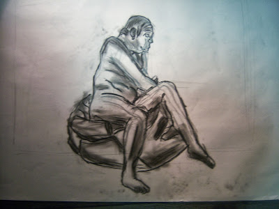
In this week's life drawing session, we started to look a lot more at texture and how it was achievable in a range of media. We were given the option to attempt media such as paint which is something i have never really focused on or used more than a couple of times across the year. I would have to learn how to use it correctly at one point or another so i decided it was time to give it a good attempt and stick with it in an attempt to improve. The vast majority of the poses were fairly short, never tolling over the five minute to ten minute marks, making it a scenario where i was forced to jump in at the deep end an simply hope/ try my best.
The first attempt came to me as a surprise due to the general difficulty, especially with the stiff, spread-out bristles of the paint brush i used in an attempt to add extra texture. While i attempted to paint, i attempted to imagine it as a pencil or charcoal and then used it in relation. This did not work as i could not smudge, adjust or remove any marks i create, on top of this, being left handed made it a rather painful process as i started from the left side of the image, making it very difficult to paint without smudging the paint with my hand. As you can see, i got very little beyond the outline done and a fairly crude one at that, especially with areas such as the head.

The second attempt was a little more structured as i felt slightly more comfortable with the paint but was still making up the techniques as i went along, which in turn created a more structured image but i was still left with nothing more than a crude outline with out of proportion arms and body. The head did not turn out too badly though shape wise. At this point i realised that i was really starting to struggle with the media but refused to give up until i created an image i was relatively happy with.

The third attempt is where things within the painting began to make more sense and generally improve as i continued. We were given an extension to ten minutes on this pose, allowing me more time focus on the outline as well as some simple shading/ texturing. Mid way through painting out the fairly crude outline when i began using a white wash to add a bit of extra detail, i realised that i could use extremely thin paint, mixed with water to create faint construction lines that i could then paint over afterwards. I was then able to use this technique in the next image. I attempted to stipple the brush and even resorted to using the opposite end of the paint brush to add texturing effects for the plant behind Gordon and the beanbag he was perched upon.

It was then time for the fourth and final painted pose which i felt relatively happy with, even if the amount of detail and texture is somewhat lacking, bare in mind that this was still a five minute painting. By painting the rough outlines first using a thin paint/ water solution, i was able to get the correct proportions before then gong over these with solid colour. Using a small amount of water, mixed with some paint, i was able to add in some basic shadowing without making it look too overwhelming or messy. I attempted to use the end of the paintbrush to add the creases in the fabric Gordon was lay across but the paintbrush seemed too rough to add any precise details.

The last pose of the evening was a fairly long one, providing us with forty minutes to fully complete it. We were supposed to create a fully shaded and textured image but i may have stepped away from this to experiment with various media, all in combination with each other in an attempt to create my own textures. For this, i drew the simple sketch of Gordon in his attire, added some simple shading and then moved to some other media. I put in all the required highlights using a stick of charcoal, smudged it wherever necessary and then added definition and fine detail by cross-hatching with a fine liner. Even though i did not get very much done of the overall image using these techniques, i felt as if it went quite nicely and taught me a lot about what does and does not go well together.

The Warmth of Colour
Life Drawing
With this life-drawing session, we were asked to bring in a selection of colours so we could use these to really show the emotion of each pose. I used two sets of colour for both warmth and cold; using a blue and purple to display any serious and somewhat sinister pose and utilising a red and orange to display more energetic and friendly poses. As the media i use was simple chalk, it made general shading and blending of colours far more effective and take very little to no time in comparison to work with pencils or paint.
The first selection of images we did were only quick drawings to show the movement between different similar poses, allowing us to practise general proportions within brief time periods such as the 5 minutes we had per pose with this selection. I found that it was easier to get the correct proportions if i started by sketching a rough outline in orange and then i decided to draw over with required details with the heavier red chalk. Due to time restrains i did not get enough time to add any real shading but due to the colours used; the poses look fairly calming and friendly.

The second set of drawings followed the same principles but with a rather strange and Halloween related twist. As we entered the room, we saw Gordon posing with a horse mask alongside two fairly lengthy knives. It was fairly difficult to take these poses seriously but with the same time restrictions as earlier, i tried to draw the fairly strange poses to the best of my ability. I generally start with the head proportions and then build down with the bone structure but due to the horse mask, this was not really possible.
The first few images were slightly out shape but as it continued, i managed to get my head round it and the drawings began to take shape. Using the cold purple and blue colours, i drew the poses using the same techniques as previously used and arrived at a product i was relatively happy with. Explaining these drawings to other members of the public makes for fairly interesting conversation.

After the quick, 5 minute warmups, it was time for the longer, more detailed sketch. Using all the techniques i had used throughout the session, i then had to draw gordon using all four colours, alongside a charcoal pencil for added details. Aposed to starting with the chalk for the outline, i used the charcoal pencil to draw the rough outline before switching to colour. The charcoal pencil felt extremely rough though and repeatedly ripped the page as i attempted to sketch out the rough details, making the face look incredibly ugly if not somewhat disfigured.
The colour itself is where the image began to shine though as i tried to use the colour birghtness levels to show both warmth, light and shadows, using th blue for the condest, darkest parts, the red for areas of irritated skin, orange for areas where light directly shines on and a small blur of purple where the light and darkness levels meet.

Subscribe to:
Comments (Atom)