We were set a number of small tasks to complete over the 12 weeks to show skill development and general proof of understanding. This included simple shading, photo manipulation and even general research in to other artists we took inspiration from. A few of these tasks are already updated in to the blog at previous points but due to my huge focus on the character, prop and environment development, i never got round to uploading these.
The Elf Archer (Colouring Practise)
This was one of the first tasks we were set out to complete and was incredibly straight forward. As an introduction to photoshop, we were provided with graphics tablets, a small sketch of a fantasy elf archer and were then told to attempt to colour it in to the best of our ability. As this was my first experience with the software and i was relatively new with graphics tablets , it was very simplistic but looking at it in comparison to my final work, you can see a huge bound in quality, especially in forms of shading and depth.
This was not just colouring practise though, it functioned more as a way of getting us to think in layers, separating different areas of the image to make them overall easier to work with and complete, making it far more forgiving that a solid image/ single layer which could destroy an entire image with just a single lapse of judgement.

Clouds (Blending and Custom Brush Practise)
This task was more of an extension on to the elf archer, getting us to think more about colour blending and the use of custom made brushes to add more definition to our images, getting away from the cell shading methods used previously.
The task was fairly loose and generally quite simple but was very helpful for teaching us the base principles of when to and not to use smudge tool, how we can make intricate looking features by simply building up simple shapes and finally, how we could then use the custom brush elements to repeat these methods over a large area with minimal time and effort.

Concept Artists
This task was entirely research based with the requirement of us finding, studying and then identifying why we like the look, feel and overall atmosphere of various concept artists work, allowing us to really get a feel for the work process and how we could attempt to incorporate these steps in to our own work.
Robert Mckinnon
http://www.krop.com/robmckinnon/#/
This was my first choice when it came to concept artists. With an obscene number of projects worked on, his concept art was included within films such as Iron Man 3, games such as Resident Evil 5, huge blockbusters such Tron, Total Recall and almost everything big in the film industry. This definitely shows in the concept art he produced, demonstrating his complete understand of life as a whole. His work consists of anything ranging for futuristic sci-fi even to pre-historical animals.

The level of detail is near unbelievable, creating concepts entirely from his own mind which end with a photo-realistic product which blurs the lines between reality and fantasy. The sheer creative genius of some of his artwork even steps on to no-mans land, mixing up ideas in such a way that they they seem near impossible and ridiculous in nature, only in seeing his concepts could you ever believe that he turned them in to a reality.

After starting his obsession for art at the age of three with a small box of crayon and ending up with such beautiful artwork, Robert Mckinnon is a concept artist that heavily inspires me.
http://www.artofben.com/
Ben Mauro is my second concept artist of choice but not because of the overall detail of his work. What i really love about his work is how he utilises sharp shading techniques to make his concepts almost stick out of the screen with a huge level of depth.
His understanding of art as a whole has allowed him to create concepts that otherwise sound impossible, for example; have you ever heard of a canine type creature mixed with the aesthetics of a metallic machine? Ben Mauro has managed to combine the elements of nature and machinery in such a defined and flowing way that the creature looks like a living being whilst also having the illusion of a man-made machine, creating a form that is generally alien to us.
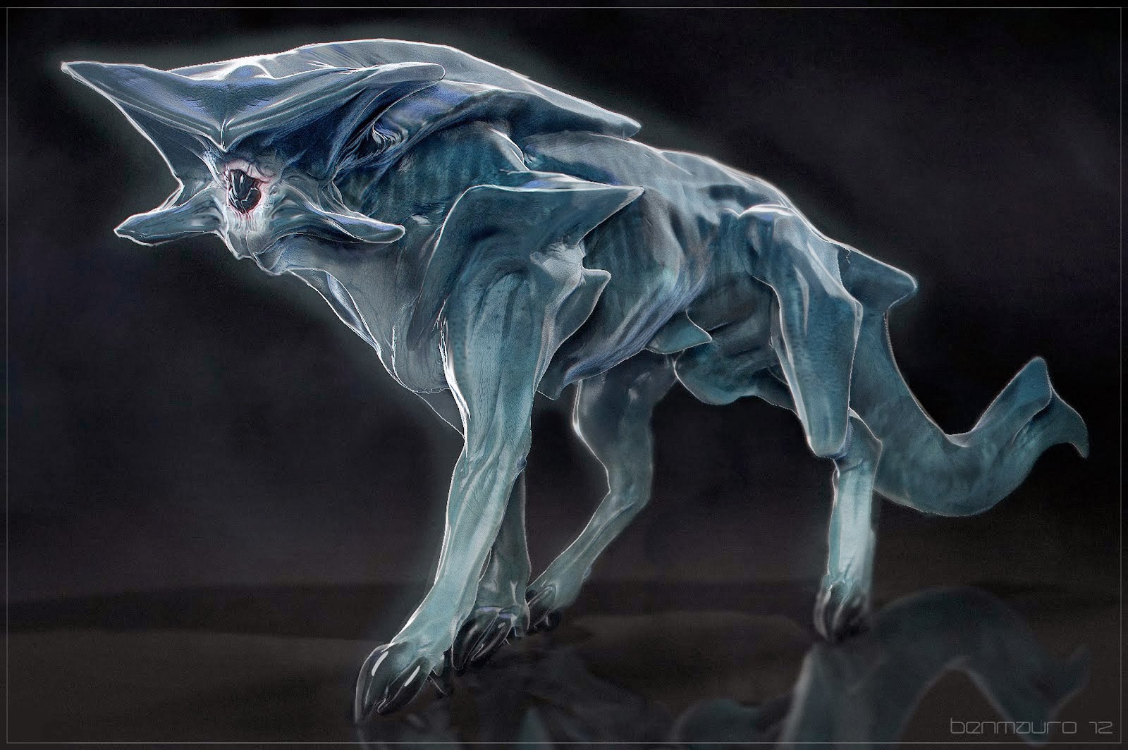
Artwork like this is what makes me want to learn and thrive in this industry. The ability to create something that could never exist is any logical setting but to then add understanding behind is truly the greatest form of art in my opinion. I just hope that one day i will be able to grasp the same level of ingenuity and understand to create such beauty.
Avery Coleman
http://averycolemanart.blogspot.co.uk/
Avery Coleman is a very different concept artist to the two previously covered in this post. To my knowledge, he does not work towards any photo-realistic concepts and adopts a very cartoon art style. This alone would not make him a very good source of reference as my development throughout the course was to lead up to a more realistic end product but there are a few areas of his work that i found extremely interesting.
Firstly, his use of colour and the contrast within his pallet. In a lot of his concepts, he has combined a lot of sharp, blunt colours that generally would not be seen but through his hand painted textures and in depth attention to both light and shadow, the work he has produced feels as if it has a warm glow and a lot of depth.

The second area is how he shows his process of building up concepts from entirely flat sketchbook work to black and white, full 3D drawings, just with the use of lighting. I find this amazing how such a flat sketchbook image can be given so much life just with the contrast of white and black. The way it so directly affects the image then allows the depth of any feature to be brought either forwards or backwards without ever having to touch the original line art.

By studying his creative cycle, i hope i can improve my own knowledge over time to the point where i can understand the depth of even a simple sketch and bring it in to a full 3D light. At this current time I'm developing a basic understanding but it is far from perfect.
Photo-manipulation
For this task, we were required to show evidence of photo-manipulation as proof that we understand the concept of lighting, tones and general details equired to place one imagine in to another without making this obvious, practically merging the images togather in a natural and effective manor.
For this, i decided to attempt to merge an old wooden house in to the clearing of the woods with all the lighting and colour differances taken in to concideration. I know its quite a generic idea but it gave me quite a nice basis to work with and allowed me to experiment with differant tools.
These were my two base images which i used from the start;

By simply looking at the images, you can tell that they are from entirely differant settings with the landscale looking very vibrant and full of life whilst the house is incredibly stale and bleak looking. Now i had both base images, i loaded the landscale in to photoshop and simply placed the house image on top of it in a area that generally looked suitable.
This left me with practically two boxes inside each other so i then had to use the pen tool to intricatly outline the entire house so i could apply a clipping mask, removing the entire boarder. The only problem now was that it looked like the house was sitting on top of the grass instead of behind it which wasa huge problem for realisim.
To fix this, i created a copy of the foreground, rubbed away a bit of the grass detail where the house was sat and then placed it above the house layer. After toying around the the clone stamp tool and blur tool a bit more to add the corre grassy overlay at the base of the house, i maanged to created a semi-realistic looknig setting. The only issue now was the lighting as at this stage i had not worked much with light and shadow, making it a fairly difficult test of trial and error.
The first thing that became apparent through was the colour differant between the images so i added a light brown filter to the overall project to push boh images to roughly the same colour scheme. Due to the position of the house, below the tree line and the direction of the light, the front of the house would be blocked away from any direct sunlight so i had to darken the windows specifically with a low opacity black filter.
After all of this was done, i attempted to repeat the same techniques for the roof where the sun would have mostly caught the house but the lighting and shadown contract to the right of the house proved a near impossible task to put right due to how i had attempted to put an incredibly dark image in to an incredibly light landscale, not to mention the lighting position.
Overall, i think it was a good starting point but i should have put more time in to find images that had roughly the same light as this would have made the task far easier and fewer changes would have had to be made.

No comments:
Post a Comment